
 Facebook
 Instagram
 X (Twitter)
 TikTok
 Pinterest
 YouTube
 LinkedIn
 Threads
 Google Business Profile
 Telegram
 Discord
How to Make Wall Art Mockups Without a Photoshoot

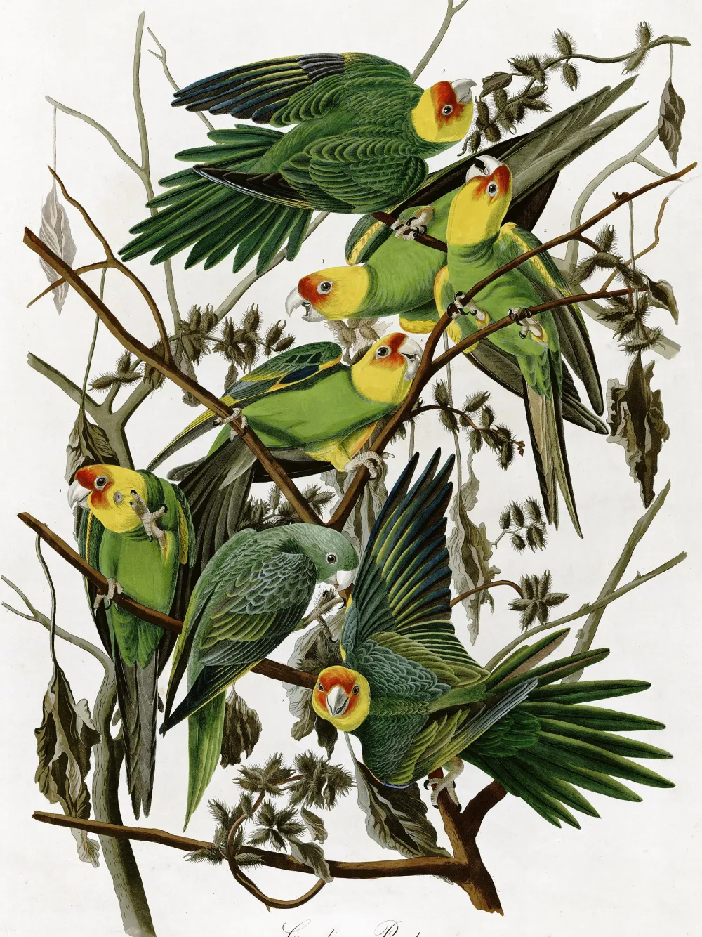
A print shop needs two pictures of every piece it sells. One is the flat file: the artwork straight on, cropped to its own edges, the thing a buyer zooms into on the product page. The other is that same artwork on a wall, in a room, at a size somebody can judge. The first one you already have, because the printer needs it. The second one is the whole job.
Most shops assume that second picture means hiring a photographer and framing twenty prints. It does not. This guide covers the three ways to get a room mockup without a photoshoot, what separates a believable one from an obvious fake, and how to build a small set of rooms you can reuse for years.
It is the practical half of our wider guide to marketing wall art on social media, which covers channels, formats and a weekly plan. Yoomru, the app we make, appears near the end where it is relevant, and we say so plainly.
Why a room mockup outsells a flat scan
A flat scan answers one question: what is the picture. Everything else a buyer wants to know is spatial, and a rectangle on a white background cannot answer any of it.
- Is it big enough? "50 x 70 cm" is a number. A print above a sofa is an answer.
- What does it look like framed? Most buyers are picturing a frame whether you sell one or not.
- Will it work in my room? Nobody buys wall art in the abstract. They buy it for one wall they already dislike.
There is also a plainer reason. On a feed, a flat product shot reads as an advert and a room reads as a room. We cannot put a number on that, and you should be suspicious of anyone who does, but you can test it on your own account in a fortnight.
None of this replaces the flat file. Keep shooting or scanning the artwork straight on, cropped to the edges, nothing else in the picture. It stays your main product image, and it is also the raw material every mockup route below needs.
The three routes to a room mockup
There are only three. Shops that take this seriously end up using all three for different jobs.
1. Photograph one wall properly
The cheapest and most honest route, and the one most shops skip because it sounds like the expensive one. You need one wall, one frame in the size you sell most, and daylight.
- Pick the wall for its light, not its looks. A wall that gets soft indirect daylight for two hours a day is worth more than a beautiful wall in a dark corner.
- Shoot from the height of the middle of the frame, square on. Standing up and pointing down is what makes a snapshot look like a snapshot.
- Put something in the shot for scale: the corner of a chair, a plant, a table edge, a person walking past.
- Lock your exposure and white balance, and shoot wider than you need, so a tall 2:3, a 4:5 and a 9:16 all come out of one frame later.
Do this once and the wall becomes a signature: a shop whose prints always appear on the same pale green wall in the same afternoon light is recognisable in a way a shop cycling through stock interiors never is. The limit is obvious. You cannot photograph a hundred prints this way.
2. Mockup templates
A mockup template is a photograph of a styled room with an empty frame, sold as a layered Photoshop file, a Canva template or a browser tool. The perspective, the warp and the glass reflection are already solved; you drop your artwork into a smart object and export. Search results for "wall art mockup" are dominated by these, and they are genuinely fast across a whole catalogue.
Two things to check before you buy. First, the licence: a lot of free mockups are personal use only, and you are using this commercially. Second, how many other people are using the same file. This is the standard complaint about templates, and it is a fair one: shop owners regularly find a competitor using the exact photo they built their listings on, and buyers who browse a category see the same living room a dozen times in an afternoon.
You can push back a little. Crop differently from the default, use the less obvious images in a set rather than the hero, and buy from small sellers rather than the front page of a marketplace. It helps. It does not make the room yours.
3. Generate the scene
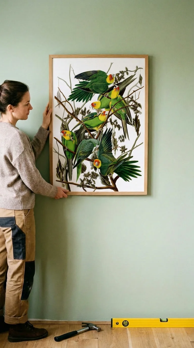
The third route is a photographed room with an empty frame and a model that places your artwork into it. The output looks like a photograph because the room was one. The artwork is yours, unchanged, in the frame's opening.
Here is the flat file above, dropped into a portrait frame by someone hanging it. The hammer and the spirit level on the floor are doing real work: they tell you how big the print is without a single number in the caption.
The same routine with a different piece, this time a landscape print in a landscape frame above a bed:
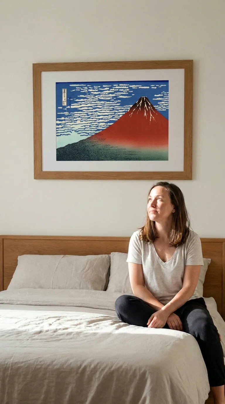
Both are AI generated, both are labelled as such here, and both had to be checked before they were used. That check is the whole discipline of this route.
What makes a wall art mockup believable
A believable mockup is mostly arithmetic. Interior designers have been repeating the same handful of rules for decades, and they are what your eye is unconsciously measuring.
- Scale against the furniture. The common guideline is that art hung above a piece of furniture should be roughly two thirds of its width. A single small frame stranded above a three seater sofa is the single most common giveaway.
- Hanging height. The centre of the artwork sits around 57 to 60 inches from the floor, which is average eye level and what galleries use. Art hung too high floats away from the room and reads as pasted on, which is exactly what it is in a bad mockup.
- Gaps in a group. When several pieces hang together, keep the gaps even: roughly two to three inches for a tight gallery wall, three to six for a looser one. Uneven gaps make a wall look unplanned even when everything else is right.
- One light source, one direction. If the window is on the left, the shadow under the frame falls right. A frame with no shadow at all is floating.
And the rule that matters more than all of them: the artwork itself must be untouched. Correct proportions, correct colours, nothing invented, nothing cropped off. If a generated mockup has redrawn a bird's wing or invented a squiggle where your signature was, throw it out. Zoom in on every one before it goes anywhere near a buyer.
The mistakes that give a mockup away
- Wrong scale. An A4 print rendered at poster size, or a poster shrunk to postcard. If your caption says A2, the image has to show A2.
- Orientation mismatch. A portrait artwork forced into a landscape frame gets cropped, stretched or floated on a strange mount. Match the shape of the artwork to the shape of the opening. The two mockups above use different frames for exactly this reason.
- Warped or repainted artwork. The failure mode of every generated mockup. Check details, lettering and signatures.
- The stock living room everyone uses. If your buyer has seen that sofa on four other shops this week, the image is working against you.
- Implying a frame you do not sell. This is a returns problem and a trust problem, not just an aesthetic one. Say what is in the box, in the caption, every time.
Building a small reusable set
You do not need fifty rooms. You need four to six that each do a different job, and then you run every new release through them.
| Scene | Job it does | Frame shape |
|---|---|---|
| Above furniture | Answers "is this big enough for my sofa or sideboard" | Portrait and landscape |
| Above the bed | The other wall people are actually shopping for | Usually landscape |
| Gallery wall | Sells two or three pieces at once | Mixed |
| Held against the wall | Human scale, no measuring required | Portrait |
| Detail crop | Paper texture, ink, grain, the things a room shot hides | Any |
| Leaning on a shelf or floor | Unframed and casual, good for cheaper sizes | Any |
Three habits make the set pay for itself. Reuse the same rooms rather than chasing new ones, because repetition is what turns a mockup into a signature. Cut every crop at once, since a 2:3, a 4:5 and a 9:16 out of one scene fill three slots for no extra work. And keep one real photograph of one real framed print in the set, as the anchor everything else is judged against.
The reuse point cuts both ways, which is worth being honest about. Here is the same room from the pillar post, with a different print in the frame:
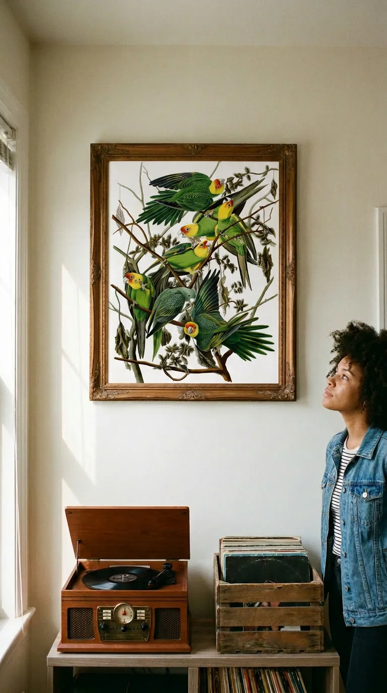
Used across your own catalogue, that repetition reads as a house style. Used by five shops at once, it reads as a template. Which of the two you get depends entirely on how widely the room is shared.
Where Yoomru fits
Full disclosure: Yoomru is our app. It is a Shopify app that posts your products to social media and generates the media to post, and one of the things it generates is a wall art scene.
There are four rooms in the wall art category: a record player corner, a gallery wall, above a bed, and someone holding a frame up to the wall. You pick a product, we place the artwork in the empty frame. Every mockup in this post came out of that pipeline, using public domain artwork rather than a merchant's work.
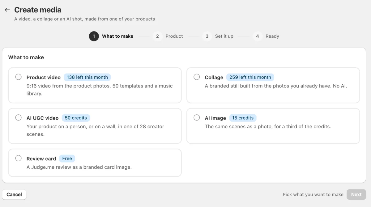
Each scene makes either a still or a five second clip. The still costs 15 AI credits, the clip 50, out of a monthly allowance that also pays for AI captions at one credit each. The still publishes anywhere, including Pinterest and Google Business Profile, which do not accept generated video. Posts carrying an AI clip get a "Created with AI" line added to the caption by default.
Four honest limits, since this post has spent a thousand words on why mockups go wrong:
- Four rooms is four rooms. They are ours, we authored them once, and every shop that uses the category gets the same four. That is the template problem at a smaller scale, not the absence of it.
- It costs credits, so it suits new releases and best sellers rather than a catalogue of a thousand SKUs.
- You still have to look at every image. Generation can redraw part of an artwork, and nothing in the app will tell you it did.
- It does not replace your own photograph. One honest shot of one real frame on a real wall says something about your paper and your colour that no generated room can.
The free plan publishes real posts rather than previews, and the feature documentation is at yoomru.com/documentations.
Before you publish a mockup
- The artwork in the frame matches the file you sell, at the right proportions and the right colours.
- The size shown is a size you actually print, and the caption says which one.
- The frame is either included in the price or explicitly excluded in the text.
- Something in the shot gives a sense of scale.
- The hanging height and the light look like a room and not a collage.
- Anything generated is labelled.
- You have cut the pin crop while you were there.
FAQ
Can I sell using a free mockup template?
Check the licence on the specific file. Free mockups are often personal or editorial use only, and using one on a product page or an ad is commercial use. Paid sets almost always allow it, and it is normally the cheapest part of this whole exercise.
Do I have to say when a mockup is AI generated?
Where the platform requires it, yes, and a line in the caption is enough. Meta and TikTok both expect realistic AI content to be disclosed. The bigger obligation is not regulatory: a mockup that misrepresents the size, the colour or the framing of what arrives will cost you the return and the review whatever the rules say.
How many mockups does one print need?
Two or three for a launch: one room shot for scale, one detail crop, one alternative room or size. Later the same print takes its turn again in a different room, which is how one piece earns posts for years rather than a week.
What size should I export?
Cut a tall 2:3 for Pinterest, a 4:5 for the Instagram feed and a 9:16 for stories, all from the same scene. Pinterest is where the tall crop matters most, and where prints tend to keep being found months later. That channel has its own rules, and they are in how to sell art prints on Pinterest.