
 Facebook
 Instagram
 X (Twitter)
 TikTok
 Pinterest
 YouTube
 LinkedIn
 Threads
 Google Business Profile
 Telegram
 Discord
How to Style Product Photos for Home Decor Without a Studio



Most home decor stores already have a decent flat product photo: the object on a plain background, evenly lit, good enough for the product page. What they don't have is time, and a styled room shot takes real time. This guide is about closing that gap as cheaply as possible, with a phone, a little natural light and props you probably already own.
It picks up where our guide to marketing a home decor shop leaves off: that post explains why room context matters more for decor than almost any other category. This one is the how.
Why a styled photo outsells a flat one
A flat product photo answers "what is this." A styled photo answers "what will this look like in my house," which is the actual question a decor buyer is holding when they scroll past your post. The difference in performance is not subtle: a styled shot gives a viewer permission to imagine the object in their own space, and a flat one gives them nothing to imagine with.
This is true even for objects that photograph well on their own, like a striking ceramic vase. A striking vase on white is still just a vase. The same vase on a windowsill, next to a coffee cup someone clearly just set down, is a moment, and moments are what get saved and shared.
Start with the flat photo, and get it right
Every styled shot, including an AI-generated one, starts from a good flat photo, so it is worth getting this part right once per product rather than fixing it every time.
- Light from one large, soft source. A window with sheer curtains at midday is the cheapest studio light there is. Avoid direct sun, which creates hard shadows a flat product shot does not want.
- A plain, seamless-looking background. A large sheet of poster board, curved gently where it meets the surface, removes the horizon line a folded piece of paper leaves behind.
- Straight on, at the object's own height. Shoot a lamp from lamp height, not from above looking down; a top-down angle on an object meant to be seen at eye level distorts its proportions in a way that reads oddly once it is placed into a room scene later.
- Fill the frame, but leave a margin. Whatever crops or composites this photo later (a room mockup, an AI tool, a simple template) needs clean space around the object, not a shot cropped tight to its edges.
A few phone-camera settings matter more than the phone itself. Turn off HDR for this kind of shot; it tends to flatten the gentle shadow that gives an object its shape. Tap the screen to set both focus and exposure on the object itself, not on the background, and if the photo comes out warmer or cooler than what you see with your own eyes, drag the exposure slider rather than reaching for a filter afterward. Skip digital zoom entirely: step physically closer to the object, or crop the image afterward, since zooming in-camera on most phones just crops and stretches the frame, quietly costing you resolution before you have even started editing.
Three ways to add a room around it
Once the flat photo exists, there are three realistic ways to put the object in a room.
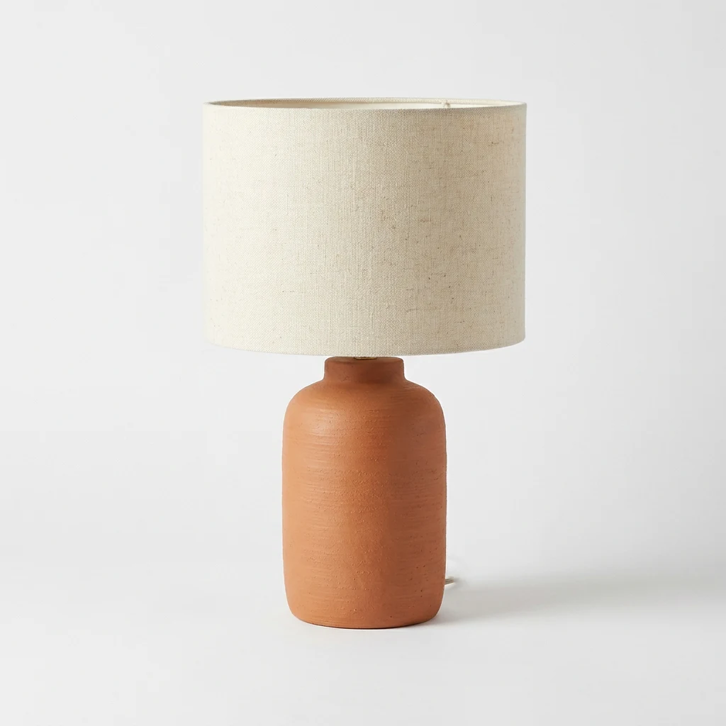
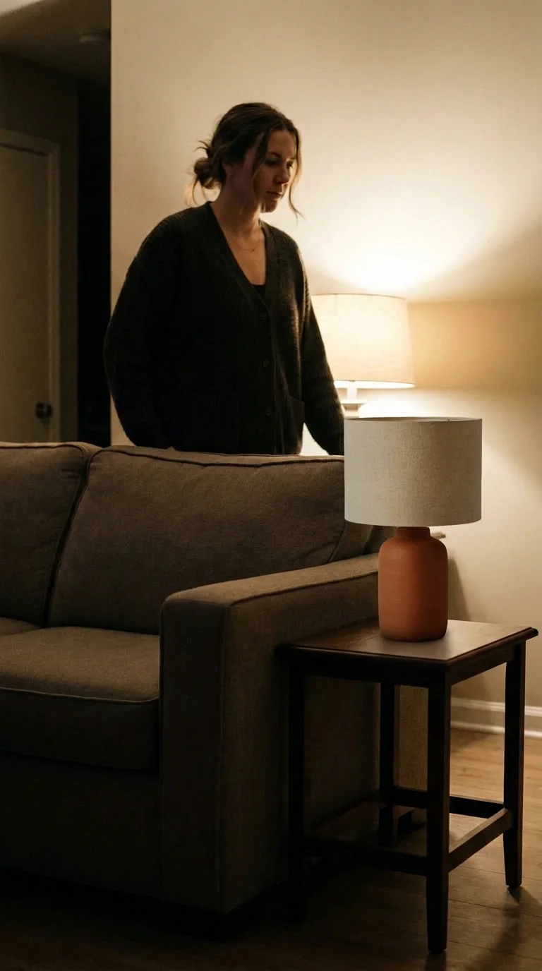
1. Shoot it in your own space. The cheapest option and, for your best sellers, worth doing properly. Pick one or two corners of your own home with good natural light: a windowsill, a shelf, a console table. Move the object there, shoot from a few angles, and reuse those same corners for every product; a consistent set of "sets" reads as a considered brand rather than a random collection of rooms. Shoot in the late morning or an hour or two before sunset if you can; midday sun through a window tends to blow out one side of the frame, while that softer light holds detail in both the bright and shadowed areas.
2. Borrow a friend's or customer's space. A room that is not your own brings furniture, wall colors and light you would not have thought to use, and it is often free if you offer the finished photos in exchange. Customer photos specifically (with permission) double as reviews and as styled content at once, and they carry a credibility a brand's own styled shot cannot fake: a real, slightly cluttered room proves the object survives contact with an actual life, not just a curated one.
3. Composite it with an AI mockup. Upload the flat photo, pick a room setting, and an AI tool places the object into that scene in minutes. This does not replace the first two options for your hero products, but it covers everything else in the catalog that would otherwise never get a styled shot at all. It is also the only one of the three that gives you the same product in five different rooms without five separate shoots, which matters most for a catalog with more products than photo days in the month.
None of these three is the "right" one on its own. A realistic mix looks like a real shoot for your two or three best sellers, a rotating handful of customer photos, and AI mockups covering the rest of the catalog, so that nothing in your store sits with only a white-background photo indefinitely.
Equipment that's actually worth buying
Almost none of this requires new gear, but a short list of cheap things does help:
- A roll of white or light gray poster board for the flat shots, replaced every few months once it creases.
- A cheap tripod or a stack of books to hold the phone still, since a shot with a shaky hand rarely composites or crops well later.
- A single reflector, which can just be a piece of white foam board, to bounce light back into shadows without adding a second light source.
- A roll of removable putty to hold small or top-heavy objects upright without visible tape or stands in frame.
A second light, a lightbox or a proper camera are all nice to have and none of them are the thing standing between you and a good photo. Consistent natural light and a steady phone outperform expensive gear used inconsistently.
Building a small reusable prop kit
A handful of neutral props, reused across every product, does more for a consistent feed than any single expensive prop bought for one shoot.
- A plain ceramic mug or cup, for scale and for a lived-in feeling on any counter or table shot.
- A folded linen or cotton throw, for softening a hard surface under smaller objects.
- A small stack of plain-cover books, for height variation on shelf shots.
- A single houseplant in a plain pot, which reads as "home" faster than almost any other prop.
- A candle, unlit, for warmth in a shot without needing to manage an actual flame.
Five props, reused constantly in different combinations, will outlast and outperform a drawer full of props each used once. Buyers do not notice a repeated mug; they notice a feed that looks like one place.
Batch the shoot, not the posting
The realistic way this fits into a small business's schedule is one longer session rather than a shoot per product. Pick a morning once every few weeks, set up one lighting spot, and run every product that needs a photo through it in sequence: flat shots first for anything new, then styled shots for anything going out soon. An hour spent this way produces a month of raw material, versus the same hour split across a dozen separate five-minute sessions on a dozen separate days, which in practice mostly does not happen.
Keep the styling simple during the batch and save the fussing for later. Move the object into place, take three or four frames from slightly different angles and distances, and move on; you can pick the best one and adjust it afterward, but you cannot get back the light you had an hour ago.
What to check before you publish
- Does something in frame tell the viewer the object's real size?
- Is the light warm and directional rather than flat and even, unlike the product-page photo?
- If this is a composite, does the product's shape, color and proportions match the flat photo exactly?
- Is there just enough surrounding context to place the object, without so much clutter that it competes for attention?
- Would this crop cleanly to a vertical Pinterest pin without losing the object?
Mistakes worth avoiding
- Mixing light sources. A shot lit by both a window and an overhead bulb usually has two different color temperatures fighting each other. Pick one source and turn the other off.
- Styling so heavily the product disappears. If a viewer has to search the frame to find what is for sale, the styling has gone too far. The room supports the product; it should not compete with it.
- Reusing the exact same crop for every platform. A square Instagram crop and a tall Pinterest pin are different photos, not the same photo resized; shoot with enough surrounding space to crop either way from one frame.
- Editing color so far it stops matching the real product. A warm filter that makes a cream lamp look yellow will show up as a mismatch the moment the actual product arrives, which costs more in returns than it gains in a prettier photo.
Where Yoomru fits
Yoomru's AI UGC scenes cover the third route above directly: pick a product from your Shopify catalog, pick a room setting such as a shelf, a sofa corner or a windowsill, and get back your exact product composited into that scene, ready to post or drop into the calendar. It is built for the products that will not get a real shoot, not as a replacement for one.
Once you have styled images, whether shot yourself or generated, Yoomru's planners keep posting them on a schedule across Pinterest, Instagram and the rest without manual work each week. Our guide to home decor on Pinterest covers what happens after the photo exists: pin sizing, boards and descriptions that actually get found.
FAQ
Do I need a different flat photo for every room I want to show the product in? No. One good flat photo, shot straight on with clean space around it, works for every downstream use, whether that is a real reshoot, a mockup or a simple template.
How many props is too many? If you have to think about what a prop is doing in the shot, it is one prop too many. Every prop should either establish scale or establish mood; anything beyond that is clutter competing with the actual product.
Should I shoot vertical or horizontal? Vertical, by default. Pinterest and Instagram Stories and Reels all favor a tall frame, and a horizontal shot is easy to crop into a square for a feed post but hard to stretch into a usable vertical pin.
What if my products are too large to photograph at home, like furniture? The same principles apply at a larger scale: one corner with good natural light, reused consistently, plus one or two lived-in props (a book, a throw, a mug) to establish it is a real room and not a showroom floor.
Is it worth editing photos in a separate app, or is the phone's built-in editor enough? The built-in editor is enough for the two adjustments that actually matter: exposure and white balance. Beyond that, most editing time is better spent shooting one more angle than perfecting one image.
How do I keep a consistent look across products shot on different days? Shoot in the same spot at the same time of day whenever possible, and apply the same one or two edits (the same slight warmth, the same slight brightness lift) to every photo rather than adjusting each one by eye from scratch.
Should product photos and styled photos ever be the same shot? No. Keep them separate on purpose: the product page needs the flat, accurate, plain-background photo, and the feed needs the styled one. Trying to make one photo do both jobs usually serves neither well.